Week 1
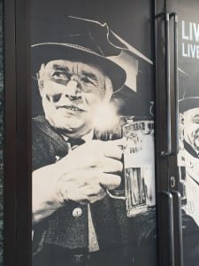
Something that caught my eye for this photo was the shadowing on the face of the man. I personly like the black and white effects in photography which, is why I was drawn to the photo. The way light is used to make darker parts stand out is something I find interesting. For example, how the black hat doesn’t get hidden with the black background but the light used highlights the image perfectly to make those parts stand out. It almost makes the image feel apart of the noir genre with the lighting used to prove effective with the effect.
Week 2
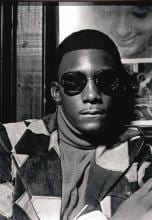
This week our workshop was based on being familiar with the Canon DSLR 600/700 D’s. Within learning how to use different techniques that would be useful for our photography projects, we went out with the camera to take a series of pictures. I personally didn’t feel happy with how my pictures came out so I’m going to be booking out a camera for the next weekend to work more on my camera skills. We also looked into William Eggleston’s photography work, I was given this image to look at and analyze.
From looking at the image I decided it was taken indoors, by the way, the lights directly over the man’s head, this light shadows his face perfectly. Also looking closer you notice the image is so detailed that the glasses do not hide the man’s eyes, the glasses are shaded and you notice how crisps the photo is when his eyes become clear to the image. The photo is also central to his face, even though his body is slanted, his face still remains center whether this is from cropping or a perfect angle.
Week 3 – No Task
Week 4 – Still Life
Week 5
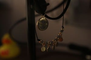
I took a camera out for a few days to work on my camera skills as I missed a session and felt I needed to work on developing my knowledge when it comes to taking my final pictures. I worked with close-ups and lighting to see how I worked best with the camera.
Week 6 – Studio Workshop (Absent)
Week 7 – Photography Studio (The Portrait)
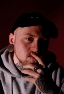
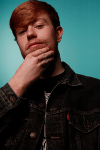
In this workshop, we worked on studio shoots, this included working with lighting and backgrounds. During the studio session, we worked on 2 different types of studio lighting. The first image is a low light placed on one side of the backdrop or model which gives us a shadow effect on the other side of the un-lit, the dark coloured background helps to keep this dark and shadow-like effect. However, the second image shows us what happens with multiple lights used on a brighter background. 2 lights have placed either side and faced only the background to brighten the colour up more and also is used carefully to separate the model from the background. another light is used in the direction of the model to light their face along with a reflector. The difference between the 2 comes down to emotion. One is dark with shadows with the model pulling a serious look to go with the light, the second is bright and vibrate again with the model posing to go with the colour (happy).
Week 8 – Lens workshop
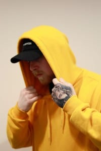
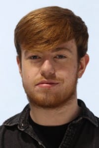
This workshop worked with different lenses. we were giving the choice of working with landscape or portrait images, I chose Portrait and worked with 50mm and 25mmlense. I wanted to capture close detail when taking the images. so, for the first image I worked with a cream background to help the yellow jumper stand out, my model had a hand tattoo which with the position he is in, the hand was closer meaning I couldn’t get his face and the hand in. I focus on the had and had his hood come up over his head to make his face darker and less likey to be the main thing that would catch your attention. For the second image, I worked with a white background to make the hair on my model stand out, again working with the close-up lenses gave me the detail in his facial appearance, almost looking like a passport photo. I do enjoy working with these types of lens and will be something I look into when doing my final project.
Week 9 – Depth of Field
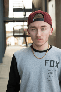
This week we mainly worked on talking about our blogs and ideas towards the final project. After, we went out to take images looking into ‘depth of field’. This would be working around blurring the background of the images. So again, I worked with portraiture and blurring the background but still so we can see whats happening behind the model used. After looking back at my work, I feel as if my portrait work is some of my more common work, most probably because it’s what I feel to be the better sides of my work. I am now thinking of ways in which I could maybe include this in my project to make it better.
Week 10 – Architecture
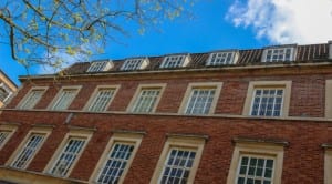
This week during the workshop we didn’t go out to take pictures as we worked on speaking about our idea’s for the project. As my project is about architecture I thought I could go out and take pictures for evidence and for our workshop task.



Leave a comment